Friday, 21 March 2014
Wednesday, 26 February 2014
Bloopers and Behind the scenes
We had a lot of fun filming and thankfully we got a lot of it on camera. We decided to create a video of some our bloopers and behind the scenes for you to share with us!
What Now Final Music Video
This is our Final Music Video
Acting on our previous feedback, we decided to remove as much shaky camera work as possible so that the audience can focus more on the image of Rihanna. We also decided to remove the dancing from Platinum Performing Arts because we decided that it was the only part of the music video which wasnt about Rihanna. Although it was representative of the torment within Rihanna's mind, we decided that it would be more effective if we used more close-ups of the artist so that she was the central image of the whole music video.
In editing we realised that the best shots were the ones when the artist was not aware that we were filming. It was useful that we had this resource of extra filming which we had done and it made sure that where there were gaps in the music video, they could be filmed with the offguard filming.
We decided to have the second verse in black and white to be representative of the past when she still had a boyfriend and the use of colour is effective because it lets the audience know that this is something which was in the past and they are no longer together.
We decided to use a fast cutting rate because when we watched previous Rihanna music videos it seemed conventional that the images changed according to the undertone of the songs she was singing. However we did notice that we broke the boundaries a little bit because Rihanna's recent music videos are extremely performance based however our music video had a strong narrative along with this performance base. There was a comment previously that our music video did go at an extremely fast pace at some points which we changed by creating some longer lasting shots so that our audience could actually see what was going on on the screen.
Continuity problems
Our actress didn't tell us she was changing her hairstyle half way through the filming process; however, we realised that possibly this wasn't such a bad thing.
Rihanna is an artist who constantly changes her image for the public eye and during her music videos therefore, the change of hair was an excellent way for us to incorporate this convention into the music video.

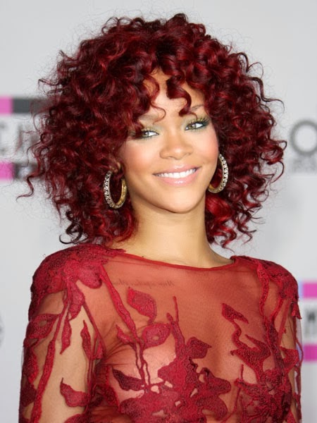


 Here she has long brown/blonde hair which portrays her as an innocent, beautiful, fun loving girl. This was her original image until she moved to a much darker, provocative image.


Rihanna is an artist who constantly changes her image for the public eye and during her music videos therefore, the change of hair was an excellent way for us to incorporate this convention into the music video.
We came to the decision that it was essential to record another session of the lip syncing where a majority of our shots were close-ups so we could follow the conventions of an RnB video and the conventions of our artist. The new hair turned out to be a really good addition to the process. The prospect of being able to change some parts of the music video so her heartbreak appeared to be a continuous progress formed interesting and new ideas.
Here are a few examples where Rihanna changes her hair during her music videos:
Rihanna-Unfaithful
Here are a few examples where Rihanna changes her hair during her music videos:
Rihanna-Unfaithful
Here Rihanna has red hair and a side fringe. Interestingly, this is when she is going to meet the man she is having an affair with. I think the red hair connotes the danger Rihanna is going through by cheating on her boyfriend; risking everything she has with her current boyfriend.
However, here she has a full fringe and ginger hair when she's with her boyfriend. Here her fringe and ginger hair portrays her innocence and happiness with her boyfriend compared to the previous image where her hair and make-up is described as sexy and provocative.
Another example of a Rihanna music video where she changes her image throughout the video is
'If it's lovin' that you want'
Here Rihanna has her brown hair in a ponytail.
Another example of a video where her image changes drastically is Disturbia.
Not only does Rihanna change her hair drastically in this video but she changes her whole image.
Here she has short, black hair with heavy dark make-up. This was the start of Rihanna's big change. Her dark hair and make-up along with the lyrics and location enhances the objective of the music video which is to bring her mental state to life.
Within seconds Rihanna has drastically changed her hair to an extremely short blonde bob. The effect of this is that within the opening few seconds we have gained insight into Rihanna's mental state.
We understand that this song is about Rihanna's 'disturbed' mind set therefore, the continuous hair changes show her spilt personality and various characters circling her mind.
Here her hair is slicked back so the focus of her image is her heavy, dark make up which symbolises images of 'The Black Swan'
I think the effect of this was to tell Rihanna's target audience about her darker side which has started to appear in this video because 'The Black Swan' is all about an innocent girl's slow pathway to corruption.
Here are a few more examples from the video 'Disturbia' where she changes her hair.
In the end we realised the hair change was a good thing because after thorough research we learnt that Rihanna uses her hair as a part of her costume to portray what the video is about. We have concluded that the minor change in our actress' hair has improved our video because we have followed another convention of our artist's music videos.
Behind the scenes Pictures

Photography
We decided to take pictures of our artist while she was filming for the lip-syncing of the music video. We thought this would be useful as she would already have the facial expressions needed to portray a strong message on the Digipak and Print Advert. We also took pictures after filming to get closeups of our artists face so that the album was all about Rihanna, which is conventional to the style of Rihanna.


Trial and Error
This was us filming an idea to have a chiffon sheet infront of the camera to give Rihanna a ghostly presence. We thought this was effective because in Rihanna's previous music videos she seems to have a supernatural presence. However we realised that this wasnt conventional to the ballad song which we were using and therefore it was no longer an option to use this footage in our music video.

Make-up
This is our artist getting her makeup done for her lip-syncing. To keep things proffessional we used a make-up artist for every time we were filming as Rihanna is all about her image and therefore we wanted our actress to look as flawless as Rihanna.
Tuesday, 25 February 2014
What Now Final Ancillary
We took on board the peer feedback from our first draft ancillary tasks. We realised we needed to do heavy reserach into our artist and the genre of music the album is. This is what we came up with.

IMAGES:
INSIDE RIGHT:
We decided to use this picture as the CD cover because we thought that it highlighted the word 'What Now' in her gestures and therefore again showing that this is an emotional album. We decided to make Rihanna's name prominent on the CD cover because conventionally we need to sell the artist.
BACK OVER:
We chose this long shot for the back cover because we thought that it coincided well with the placing of the track list. The audience can also see that it is a simple imagine of the artist singing which we thought would be effective because although it is so simple it gives out a strong message of what the album is about (pain and love).
INSIDE LEFT AND COPYRIGHT INFORMATION:
We decided to place our copyright information in the centre of the inside left cover as though it has been placed around her body to show that this copyright information is important. The strong facial expression in the background balances out the importance of both artist and copyright information.
TRACKLIST FONT:
We decides to use this font for the track list because it is the same as the conventional scratchy font for Rihanna. However in a smaller font the writing works well with the simplistic background.
 FONT: From our peer feedback we
established that we needed to use one dominant, appropriate font so we decided to change the font to a white graffiti style to
be conventional with Rihanna’s previous albums. This is effective because the
previous font was not conventional with Rihanna’s music and the colour was red which contrasted with the background pictures. With the conventional white font
it is both easier to read and shows the light ballad side to the songs on the
albums. Plus on a black background it stands out for the audience to see.
FONT: From our peer feedback we
established that we needed to use one dominant, appropriate font so we decided to change the font to a white graffiti style to
be conventional with Rihanna’s previous albums. This is effective because the
previous font was not conventional with Rihanna’s music and the colour was red which contrasted with the background pictures. With the conventional white font
it is both easier to read and shows the light ballad side to the songs on the
albums. Plus on a black background it stands out for the audience to see.

RECORD LABEL: It was essential to include Rihanna’s label ‘Def Jam’ and Universal to create a realistic print advert.


Digipak
IMAGES:
INSIDE RIGHT:
We decided to use this picture as the CD cover because we thought that it highlighted the word 'What Now' in her gestures and therefore again showing that this is an emotional album. We decided to make Rihanna's name prominent on the CD cover because conventionally we need to sell the artist.
BACK OVER:
We chose this long shot for the back cover because we thought that it coincided well with the placing of the track list. The audience can also see that it is a simple imagine of the artist singing which we thought would be effective because although it is so simple it gives out a strong message of what the album is about (pain and love).
INSIDE LEFT AND COPYRIGHT INFORMATION:
We decided to place our copyright information in the centre of the inside left cover as though it has been placed around her body to show that this copyright information is important. The strong facial expression in the background balances out the importance of both artist and copyright information.
TRACKLIST FONT:
We decides to use this font for the track list because it is the same as the conventional scratchy font for Rihanna. However in a smaller font the writing works well with the simplistic background.
Final Print Advert:
FONT: From our peer feedback we
established that we needed to use one dominant, appropriate font so we decided to change the font to a white graffiti style to
be conventional with Rihanna’s previous albums. This is effective because the
previous font was not conventional with Rihanna’s music and the colour was red which contrasted with the background pictures. With the conventional white font
it is both easier to read and shows the light ballad side to the songs on the
albums. Plus on a black background it stands out for the audience to see.RECORD LABEL: It was essential to include Rihanna’s label ‘Def Jam’ and Universal to create a realistic print advert.
PHOTO AND FRONT COVER OT ALBUM-Although we were complimented on
the strength of our image and content in our peer feedback we did another photo
shoot with our artist and found our images were far stronger. From research we
learnt Rihanna is all about her image so we chose to use a close up image of
her face. The emotion Rihanna portrays in her print adverts and digipaks conventionally convey what the albums music will be about. The image we chose
to use presents her as sad which reflects the type of album we’re releasing. We
are promoting her image at the same time as selling her music through her
image.
Friday, 31 January 2014
First What Now Ancillary


Peer feedback:
The feedback that we got was that there were too many fonts and that it seemed to disproportionate. This made us think that we needed a dominant font which was consistent throughout both the Digipak and the Print Advert. We were complimented on our strength of image and content. NME and Billboard, are written with too big a font. After receiving this feedback we have decided that in making improvements to both ancillary tasks we will make them simpler. They seem to be too jumbled and therefore we will get stronger images to give across meaning rather than more writing.
The feedback that we got was that there were too many fonts and that it seemed to disproportionate. This made us think that we needed a dominant font which was consistent throughout both the Digipak and the Print Advert. We were complimented on our strength of image and content. NME and Billboard, are written with too big a font. After receiving this feedback we have decided that in making improvements to both ancillary tasks we will make them simpler. They seem to be too jumbled and therefore we will get stronger images to give across meaning rather than more writing.
Subscribe to:
Comments (Atom)